Great Art needs a name.
Imagine an artwork comprised of a lifesized skull made of platinum, with real teeth and encrusted with diamonds. You probably know the one I mean. Now think of its title
“For the love of God”
Think of Damian Hirst’s piece, and whatever you might think the artwork itself, the name provokes thought. It conjours up thoughts of decadence and futility. Of vanity, the ultimate vanity,
Not only of leaving a beautiful corpse but a pretty skeleton too!
I can’t claim to be a Damian Hirst fan myself but you have to admire his promotional skills. That art courts controversy is nothing new, but it’s that very controversy which catapults such artists into the media limelight, be it rightly or wrongly.
Would calling it “Diamond skull” or, my personal favourite, “Glitterball” have evoked the same response?
Quite possibly, but I think the nuances would have been very different. One suggests laziness whilst the other a crass indifference to death and mortality. It’s mocking in it’s implication.
This is one piece where the title takes the artwork to a whole new level,
as well as voicing the thoughts of many who view it for the first time.
I’m not going to go into a debate about the value of these types of art at the moment – another day perhaps.
Artists throughout time have used titles. Until recently I never bothered with titles but I’m increasingly seeing there importance. It’s hard with some pictures to come up with more than the visually obvious e.g. “The Lloyds Building” below.
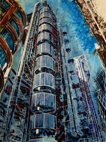
It’s functional, it says what it is on the tin!
but it’s also lacking. It’s better than “untitled” but it’s descriptive. Great for cataloguing a piece but not transcending it. *yawn*
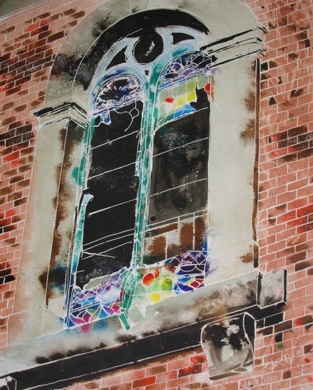
Sometimes I try and evoke nostalgic memories like with “Window on the Past” here
Other titles I considered were “Lost Spirit” and “Past life”?
I look for a title to make you think. Sure, that might be that I’ve finally lost the plot and I’m living in cloud cuckoo land, but THEY MAKE YOU THINK! Once you start thinking you see more than a pretty picture, you engage with a story or idea. You’re getting an insight into the workings of the artists mind.
Maybe that’s the difference between a work of art and a painting?
Help, I think I might be learning to appreciate Damian Hirst’s art! Naaa, it’ll take more than that to convince me! Although it’s making a lot more sense than it used to.
It’s not always easy to find a title, but it always helps
I will leave you with another abstract architecture piece.
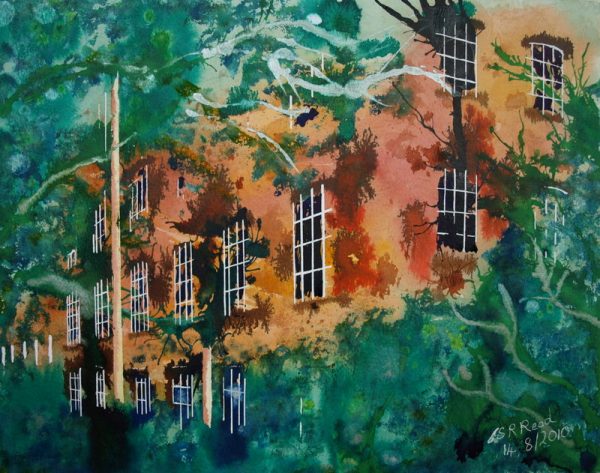
It’s one of my earliest architectural works and is called Man vs Nature. I’ll leave it to interpret it for yourself!
You can see more of my earlier urban art in the Industrial Landscape Portfolio.
So, that’s why I love titles on my art.