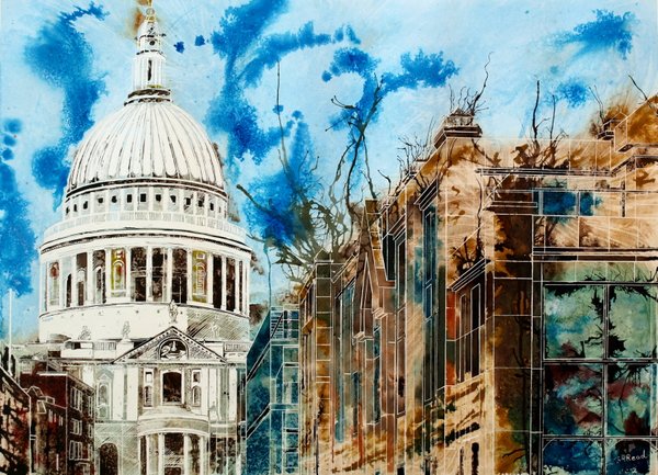
The Life of London Churches painting depicts St Paul’s, bleached white by sunlight. It’s elegant, classic, austere and aloof. In stark contrast to the buildings on the right. They’re mucky, blurred. And imprecise. It’s hard to see the windows in details, unlike the crisp white lines of St Paul’s. The shape of the dome makes the building instantly recognisable but I always find it cold. White marble, reflects the light back. There’s a bluish colour to it, and the shadows are shades of brown. The columned balcony reminds me of a zootrope. The columns themselves the slits. I half expected the whole top to spin and a moving image to appear.
I have a love/hate relationship with church architecture, especially grand churches such as this. It stems from a catholic education and I always felt these building miss the point of the faith. The detail is awesome, but is it a monument to God, or to man? I never know with buildings like this. Sure, there’s an argument that we built it to honour the glory of God. But compare it to a mountain range or a beach in a craggy bay, and I’d say, St Paul’s pales into insignificance.
The painting was started just before the Occupy protest about inequality and poverty in 2011 and finished a little while after. I heard that St Paul’s locked their doors and I was surprised. A church closing its doors at a time when people were sleeping on the streets, seemed wrong. Even if it was intentional. At the very least, I expected an open prayer vigil.
The trouble with churches being national icons, is that there’s a conflict of interest between the role of the church, and the preservation of the landmark. To quote the good book, man cannot serve two masters.
Looking at this image brought that stark contrast to mind because one of the buildings on the right, belongs to the Salvation Army,. A church known for handing out food and clothing to people on the streets. Did they do the same? I don’t know, but I doubt it. A response like this would have sent a better message to those campaigning and those they were trying to influence. I’ve always felt actions speak louder than words.
St Paul’s, monochromatic, almost print like. You may notice the blown ink. I think of these tendrils as energy, a lifeforce emanating from buildings like electricity. So, feeling they should reflect positive energy, it felt right to leave them off St Paul’s. You may see them on other paintings, but not this one. It marks a past event. and I hope that, if the situation arose again, their response would be different. More active, open and prayerful.
So that’s why it’s called the Life of London Churches.

Curious to see more London Paintings?

