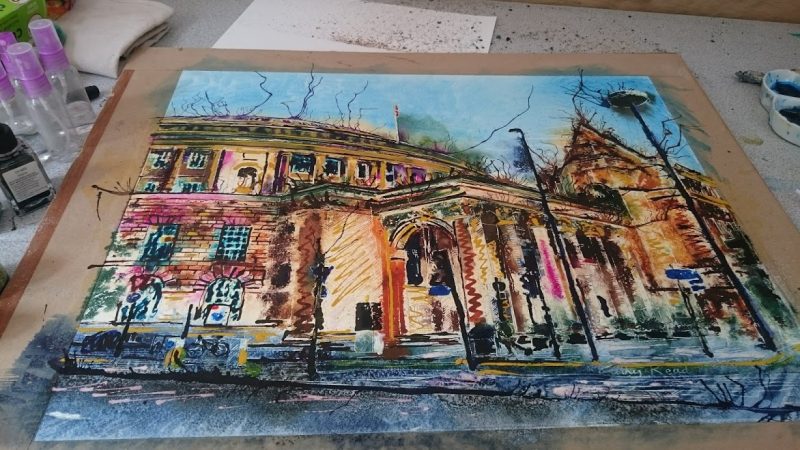
To some, painting colour and Manchester don’t combine.
They see Manchester as a grey and wet place and, like most English cities, it can be. Graphite images reflect that perception.
But if you look carefully you’ll find colour, even on dull days.
Recently I’ve been taking risks with painting colours.
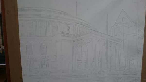
With inks that can get a bit extreme. Like the moment I added magenta to this painting of Manchester Central Library. Here’s the masked image before all dull and tame.
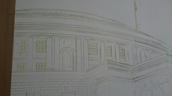
Then I added the magenta along with a few other colours.
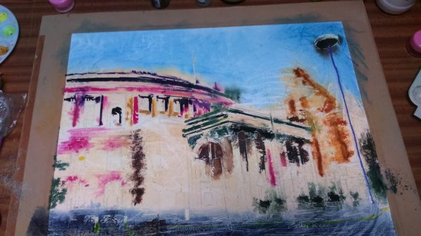
Painting colours can seem extremely bright,
when first applied. Especially when viewed next to white paper. But, they don’t stay that way though.
Colours darken as they dry.
They tone down when you add other colours either next to them or to balance them out.
They also mix with existing colours and spread around with the water on the page.
So what seemed like scary bright can be pulled back, but not too much.
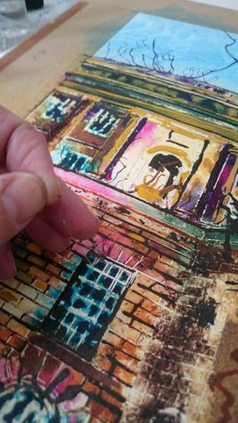
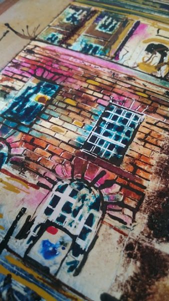
With my paintings the removal of the masking fluid helps to bring balance and some of the paint is lost in the process.

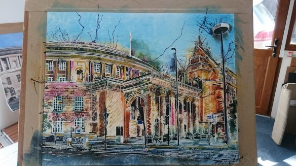
So a painting with colours that began like this one above
Ends up like this…
Enjoy this post? Like to see more behinds the scenes work or get access to exclusive materials.
Please consider supporting me by becoming a patron? It’s simple to do and patronage starts at $1 a month.
Become a Patron!

