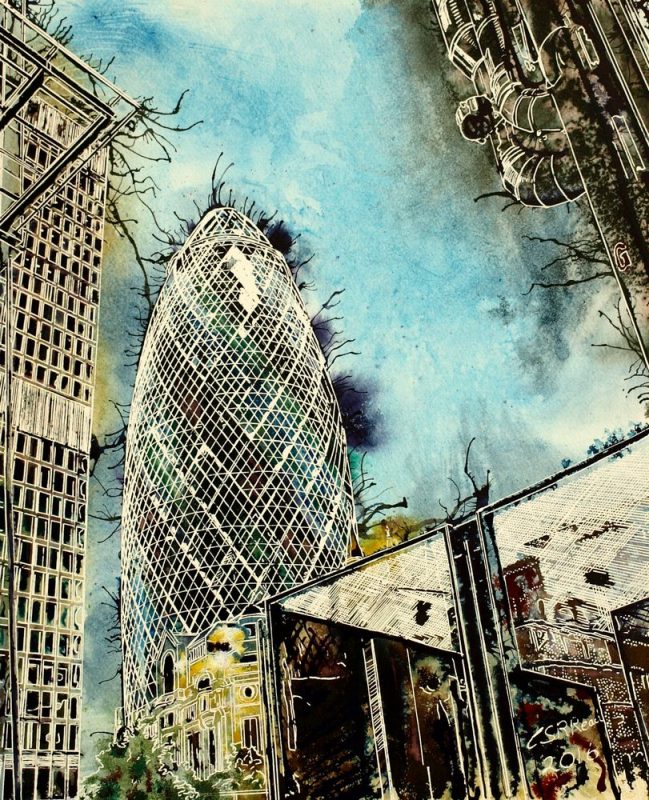
It can be hard to escape the view that cities are grey, if you look at much London Art.
Although in reality there is an exuberance of colour. Views like in this Leadenhall Street painting tend to reinforce that perception of a grey mass often in London art. The adjacent Lloyds building is more silver than grey perhaps. Then we see The Cheesegrater. It has colour but this angle hides it away from view. Perhaps it’s an attempt to show a more serious face on the main Leadenhall Street? After all, everyone knows that colour is frivolous, although why that should be so has always baffled me.
The three generations referred to in the painting to are:
The Lloyds building, the Elder statesman with all its shiny pipework. Then the Gherkin, it’s been around long enough to be established in the collective consciousness. Finally there’s the Cheesegrater, the new upstart, barely visible but creeping into shot and difficult to miss. The contemporary feature of London Art
The sky seems a little cloudy, not it’s usual brilliant hue and there seems to be free exchange of colour. Some crystalline stars appear on the pipework, help to lift the gloom along with blooms in the deep shadows.
The foreground of the Leadenhall Street painting is dominated by the fenced off machinery area right in front of the Lloyds building. You may feel it’s ugly but it’s part of the place. A way to understand the structure and ethos behind what is seriously radical design. Have the working guts of the building on display for all to see. The other two buildings have gone to the original design idea of clean external lines and see where you can fit the workings inside.


