29 Hospital Steps Painting
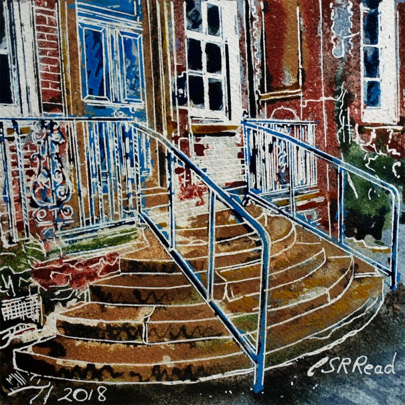
There’s a lot going on in this painting of Hospital Steps. The Victorians certainly didn’t subscribe to the notion “Less is more”. Everything that could be decorated was. The curved steps, the elaborate ironwork railings. Brickwork of contrasting colours. Panels on the doors, multi paned windows. There is too much detail, it needed to be bigger this painting, but being small forces you to look at the steps. The other details get lost in the background to the curving stack of steps. They look like the stacking rings of a child’s toy but without the colour. Everything points to the grand door, the entrance to the hospital when it was opened. The handrails seem out of place. Maybe they were added when they realised that people who need hospital often have mobility problems, It’s bad enough that the steps are curved, but no handrail would have been a disaster.
Part of the detail is the colour. So many colours, I think I might have used every ink I possess. There are blooms merging red brown to ochre, light blue zigzags over indigo. Ochre defined by nut brown squiggles. Olive green bushes with Prussian blue bases and a dappled footpath of sepia and brown which morphs into indigo with star flashes of pink around dark specks.


