Painting of Charing Cross Station - ©2019 - Cathy Read -watercolour and acrylic ink-51-x-41cm

Creating a Painting of Charing Cross Station

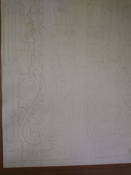
The begining of a painting always looks strange. Funny parts, disjointed and never quite making sense. My pictures always look grubby until the paint is applied. They also have a ghost like quality common of pencil outlines. The addition of masking fluid causing an unclean appearance. This painting of Charing Cross Station is typical of the masking phase. You can make out the lamp post and the windows and the vague ethereal shapes of railings.

Work in progress -©2019-Cathy-Read-Mixed-Media-51-x-41cm
Charing-Cross-©2019-Cathy-Read-Mixed-Media-51-x-41cm

As, I was saying they look grubby, but then, with some colour, they suddenly become luminous.

Charing Cross - ©2019 - Cathy Read -watercolour and acrylic ink-51-x-41cm
Charing Cross – ©2019 – Cathy Read -watercolour and acrylic ink-51-x-41cm

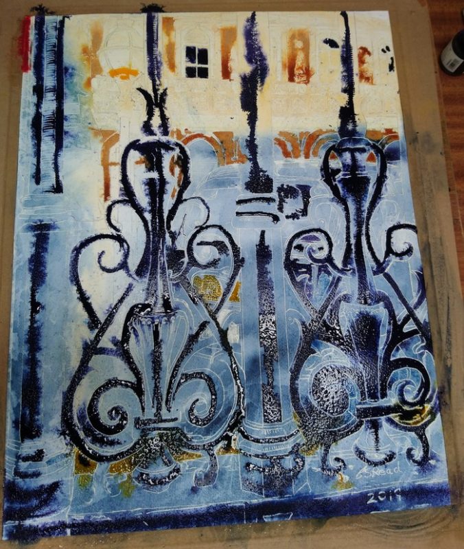
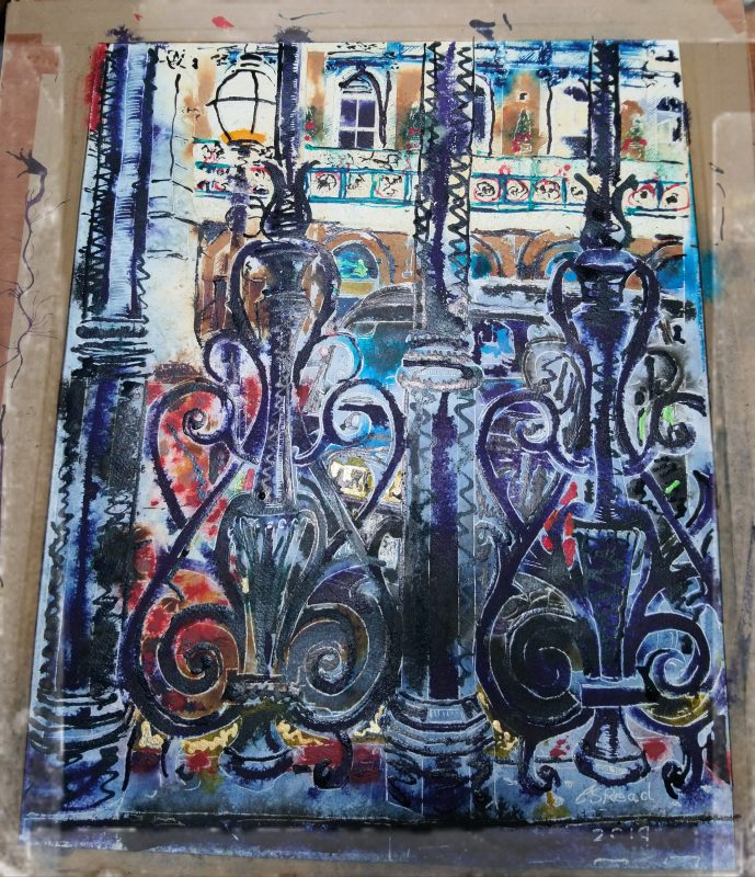
More colour, applied in layers, brings the image into focus. The contrast isn’t quite as marked but still significant. You can make out the Amba Hotel in the background now. Paintings have a heavy laden appearance at this phase.

©2019-Cathy-Read-Charing-Cross-Watercolour-and-Acrylic-41-x-52-cm

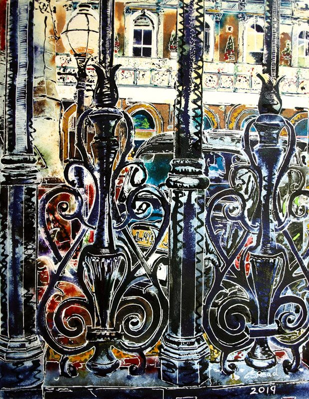
Finally the masking is removed and the final image comes into focus.

Charing Cross Station - ©2019 - Cathy Read -watercolour and acrylic ink-51-x-41cm
Charing Cross – ©2019 – Cathy Read -watercolour and acrylic ink-51-x-41cm

If you enjoyed seeing my painting of Charing Cross Station emerge, would you like to see more, as they are create?. I send out a newsletter once a fortnight with my latest paintings and news about events and exhibitions I’m invovled with.

Ensure you don't miss the latest pictures

Leave a Comment

Your email address will not be published. Required fields are marked *

This site uses Akismet to reduce spam. Learn how your comment data is processed.

Scroll to Top