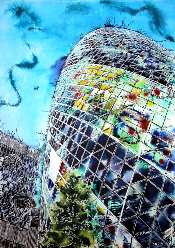
The Harlequin Gherkin is a painting of one of London’s most widely recognised examples of contemporary architecture. Appreciated the world over, its unique and bold design has won it many awards. Including the Stirling Prize, the London Region Award, and the Emporis Skyscraper Award.
Cathy Read’s mind went all over the place when looking at this painting. So what did she see? First the colours attracted her. The Gherkin in harlequin colours, beside the monochromatic building, reflects the outline and shape of its neighbour, but none of its colour.
Shape caught Cathy’s attention next. The pattern of glass panels also suggesting the Harlequin theme as Diamond shapes curve around the Gherkin’s form. Its smooth curves contradicted by the angular shape of the sections. Despite its rounded shape, the Gherkin uses only one piece of curved glass – the lens right at the top. The elliptical spiraling shape is due to design, where each floor rotates 5 degrees from the one below.
Why design the Harlequin Gherkin building this shape?
Simple answer, “Someone wanted to and figured out how to do it in the process.” That is how innovation works. Other buildings with curving structures have been developed both before and since – it is how fashions work. We see something we like, and we want. If we have the money and ambition, we get.
The tower’s shape was influenced by London’s physical environment. The smooth flow of wind around the building was one of the main considerations and the tower aerodynamically designed to reduce wind load on the structure, whilst the lower part tapers so that wind wraps around the tower.
On the efficiency of shapes
This gets us thinking about the efficiency of shapes. There have been curved buildings before, but the demands of construction materials influenced their production. Was it the case here? Did the ability to create this form, come before it was designed? Or did they design it and develop the materials and construction to enable its creation. Maybe it was somewhere in the middle. The Gherkin used 35 kilometers (22 miles) of steel and 7,429 panes of glass– the equivalent to three football pitches.
Efficiency of shapes depends on many factors. Glass, when blown naturally, creates a curved form. When cutting lengths of carpet for a house, square rectangular shapes are best. Fitting square furniture against curved walls causes issues with fit. Shape can be the demand of the materials, as in the glass example. It’s also the demands of function that influence shape. There is never going to be a successful wheel that is square.
Books – well that is a different matter. Other shapes can work, but the vast majority will be rectangular. Because it works.
Then there’s fashion. How many things are the shape they are because fashion dictates? We have been used to one style and shape, and someone shows us a different shape style and possibility. And we all flock to try it out.
A last glance at the Harlequin Gherkin
Looking back at the Harlequin Gherkin painting, see the way the buildings are subdivided into little shapes? With imagination, one can see little images within each section – like tiny paintings within the whole and framed in white lines. From deep skies with a single moon or star in one to explosions of colour in another. Others are straggly trees in all shapes andyet more are more abstract, amorphous forms with curious shapes. In parts the painting appears semi-transparent, an effect caused as painted blooms are blown up over the cross hatching.
Finally, a single unlit lamp is lost in the left-hand building’s details. Then again so much vanishes in this image of the Harlequin Gherkin. It is hard to be noticed when standing beside such a brilliant star.

