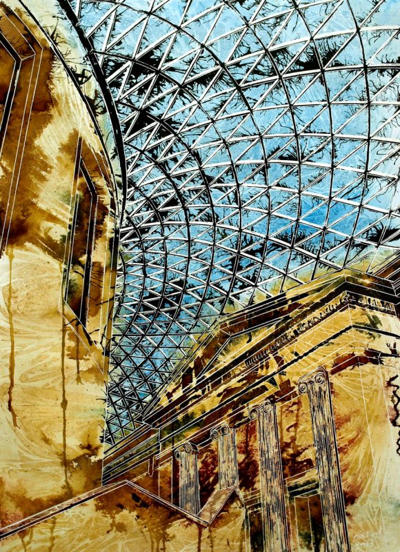
If you say British Museum Art, you’d probably think of the contents, but the building itself is a work of art and, as such, inspires its own art.
The Roof of the British Museum has a particular appeal curving this way and swaying that. Drawing it is a challenge. There are distinct sets of spars criss crossing to form those triangles. All varying in size and shape.
It’s like a maze. If you let your eye follow one and make a turn, at a junction, you can cover the entire picture rapidly. Well entire roof part of it anyway.
Sometimes you get lost in the process. The stone buildings, the rotunda and columned entrance reflect the warm sunlight shining through the glass. Ochre stone is textured with ripples caused by clingfilm. A pattern that’s echoed in the deep blue sky. Dark recesses are picked out in Burnt Umber, sepia and dark madder, inks. Blooms of colour dissolve into lined columns, giving a translucent appearance.
The spars of the roof, are picked out with black ink, which has been blown with a straw to form tendrils reaching out into the void created in between. Some triangular voids keep the blue sky, while others make space for the growing tendrils, and yet others, obliterate the sky is and let dark, blackness take over completely.
The layers have been kept to a minimum in this piece, allowing the watercolour free rein. Keeping the image simple and fresh. Areas of stone contrast starkly with the complexity of the roof. The overpowering detail on something so simple in concept. Yet intricate and complex in execution.
Curious to see more London Paintings?


