Have you heard the quote that good art needs a good frame but bad art needs an excellent frame, or something like that? When I first started working as an artist, I happily used any frame. Second hand, IKEA frames, different colours, odd shape mounts, never considered how the back looked, whatever I could find. I didn’t know how to fit pictures into the frame, and was happy with every colour of the mount under the sun. Photos of my early exhibitions show the resulting chaos. Sure, the art itself was good, but the framing… errrr no! *Hangs head in shame*
How I cringe when looking back. If you have one of my earlier pieces, my apologies. It took me a while to get the framing right. Some people seem to instinctively know, but for me there was a process. For my first exhibition I knew it needed to look right and invested heavily in framing.
I went for foiled silvery gold frames. They looked fabulous and I’d still be using them, if I had just hung them on the walls and never had to move them. The trouble with foiled, soft wood frames is that they damage very easily. Almost immediately I took them to exhibitions, they were damaged and chipped in transit. Foiled wood is hard to repair and quickly looks bad.
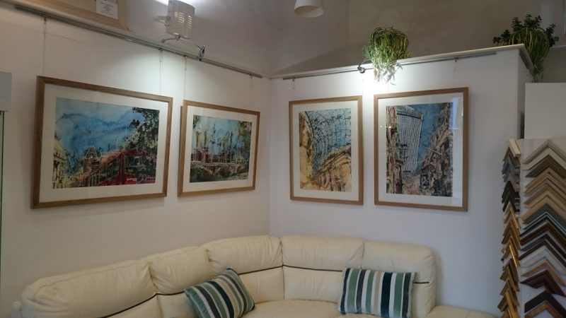
Next, I tried oak framing. (Below) These also look great and are more forgiving when scratched and battered in transit. They did get damaged, but were easier to repair. The downside was the colour of oak didn’t work with all my pictures. They looked good but not as good as I knew they could.
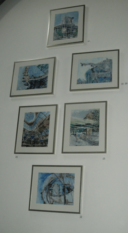
Then I went into framing each picture individually. This was great for the paintings with bold colour schemes, like with national memorial. The art looked marvelous on it’s own but, when displayed as a group at an exhibition, the frames competed for attention.
Back to the drawing board then, or in this case, the framer.
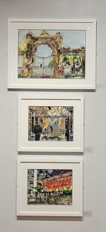
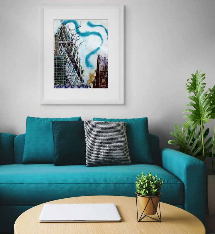
We discussed many options. I liked the wide mount, and we’d recently started using a double mount option, off-white over a bold colour at the bottom, which worked well. The line of colour is a perfect, finishing touch. We looked at various colours, and he asked if I’d ever considered white? Occasionally, I’d tried black, and that worked but never felt right. Until then, I’d always dismissed white, having seen many images in tacky white frames. Then I learnt that there are white frames and there are white frames. When I saw one of my paintings custom framed in white, with a double mount off-white over dark grey, I knew we’d found it.
Frames should flatter, not compete with the art.
White emphasises the painting. It blends in with white or neutral walls and forms a barrier between the art and coloured walls. Yes, it still gets damaged in transit, but that’s easily fixed with spray paint or a touch up pen. If it’s really badly damaged, I will reframe the pictures when sold.
Other framing considerations
I haven’t even begun to discuss the shape of the moulding. Again, it’s personal preference. I tend to keep it simple, plain, square and undecorated, anything else looks old fashioned to my eyes.
Glazing is another issue. To glaze or not to glaze. My art is on watercolour paper so needs to be protected under glass or something. In reality, a layer of glass detracts from the visual effect of the art. I want people to be able to see the image, without the glass barrier. I have a workaround, but I’m still fine tuning, so maybe I’ll leave that discussion for another post.
In short, framing matters, always take the time to get the framing right. You won’t regret it. Any picture will look good and a great picture will look stunning.