About the painting
9 Juliet Balcony
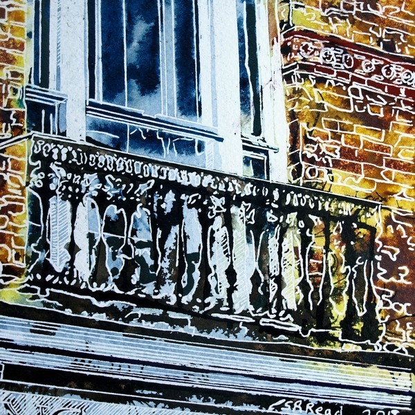
Sometimes there’s too much in a scene to do it justice. This picture would have benefited from being scaled up. There were more colours and details than the techniques allowed for and there is so much masking that the paint had little time to move. Despite all this, it has a unique charm and is one of my favourites.
The happy yellow walls, the ornate ironwork on the balcony. The image of people looking out and calling to those below.
It’s called you a Juliet balcony and it’s easy to imagine the scene especially if you don’t know what Bridge Street is like. In reality, where the Juliet Balcony is, built up. No bushes to hide behind, but I digress.
The image is well defined ans busy. There are a few areas where colours have tried to make their mark but, mostly, they’ve been forced to stay within boundaries. Graduated colours keep to the yellow/orange/brown or blue spectrum there is nothing in between.


Reviews
There are no reviews yet.