About the Painting
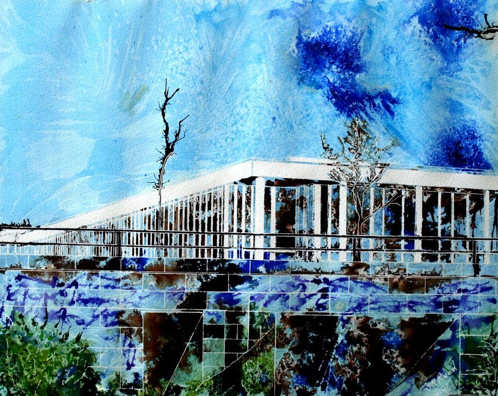
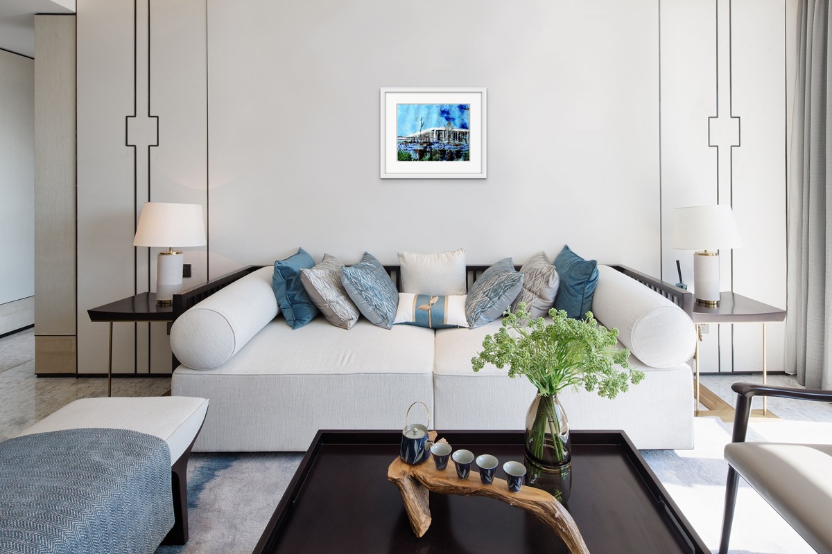
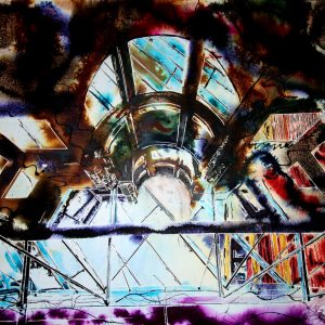
Underpass is Midsummer place
Everywhere you go in Milton Keynes there are roads. The planners created an infrastructure which enables cars and pedestrians to move around without having to cross each other’s paths, well that’s the theory anyway. In practice the car is still king but these underpasses are at every major roundabout in the centre and allow foot traffic and cyclists to cross the main intersections safe from cars. Invisible though they may be from the road they are typical of the area for anyone who steps out of a car here.
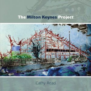
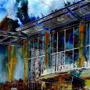
This painting is part of the Milton Keynes Project and features in the book. The brief: to create art inspired by the iconic structures around MK. A series of 20 paintings commissioned by Fringe Art MK Westbury
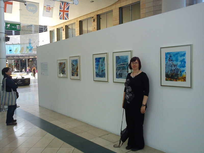
12 Paintings were exhibited at Project Space in Milton Keynes 13th June – 6th July 2012.
Coming to Milton Keynes in 1988 I found an established but still rapidly developing city. I was intrigued by the conscious aim to create something new. From the layout of the roads and redways to radical experimentation with architecture. Design and everyday living sitting side by side.
Milton Keynes dares to be itself. Not a pale imitation of traditional urban life.
As a new city it stands out and as such has a very different character from most cities in the UK. Milton Keynes developers chose a new way to be, and that’s what this series sets out to highlight. The architecture reflects that life and vision. From the dominance of buildings such as the Point to the everyday unobtrusiveness of an underpass and the shopping centre. My aim is to show the MK the residents know.
I depict buildings, not as static constructs but as frameworks around which the plays of everyday life are enacted. Buildings would not exist without people. They echo their creators both the people who design and those who build them. Likewise the people who inhabit a building are influenced by its spaces, breathing life and energy into it. The paintings are like these lives, sometimes ordered, but other times chaotic; simple but also complex; isolated and yet connected.
Materials used: Watercolour and acrylic ink on Watercolour Paper
Dimensions 40× 50× 0.2 cm (unframed) / 39× 49cm (actual image size)
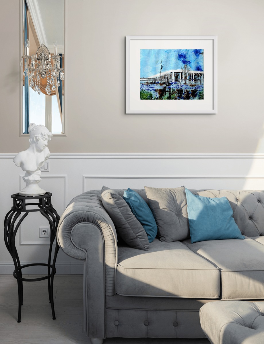
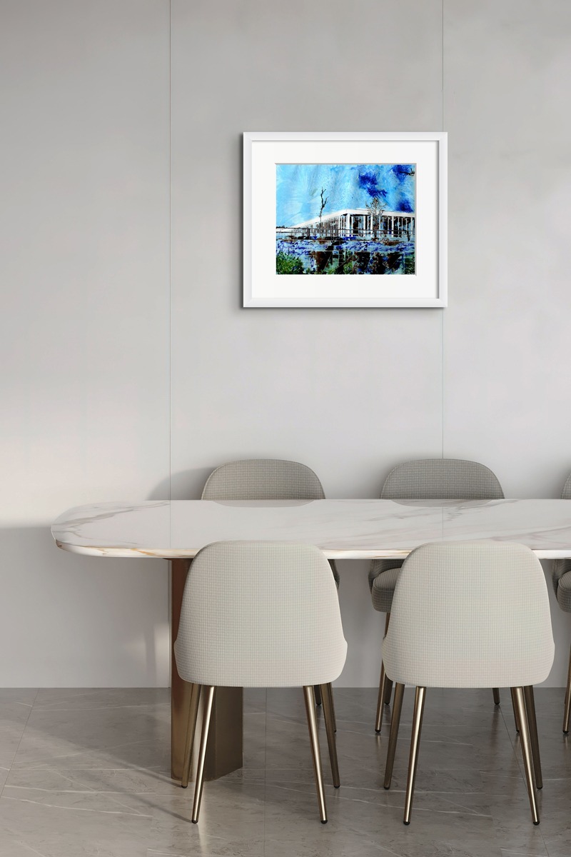
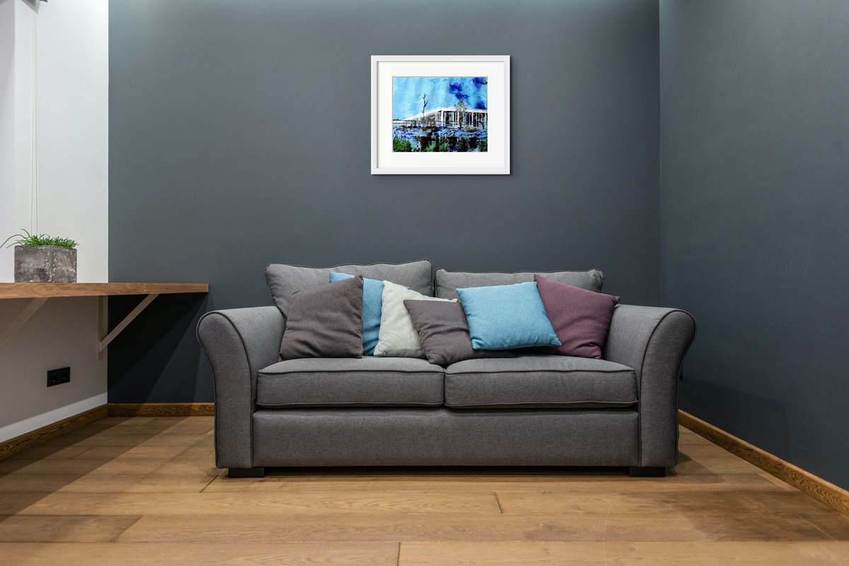
Framing: This artwork is sold unframed. Images are for guidance only – Framing can be arranged in a white frame with double mat off white and dark grey.
Please allow up to 2 weeks for delivery;
All paintings come with a certificate of authenticity.
Creation
The picture is painted on watercolour paper. Cathy draws the lines with masking fluid to a planned arrangement before painting it with a watercolour wash which gets covered with clingfilm. Once this is removed the picture is further developed using acrylic inks which are left to dry before the masking is removed to reveal the final picture.


Reviews
There are no reviews yet.