London Icons Digital Prints
About the Image
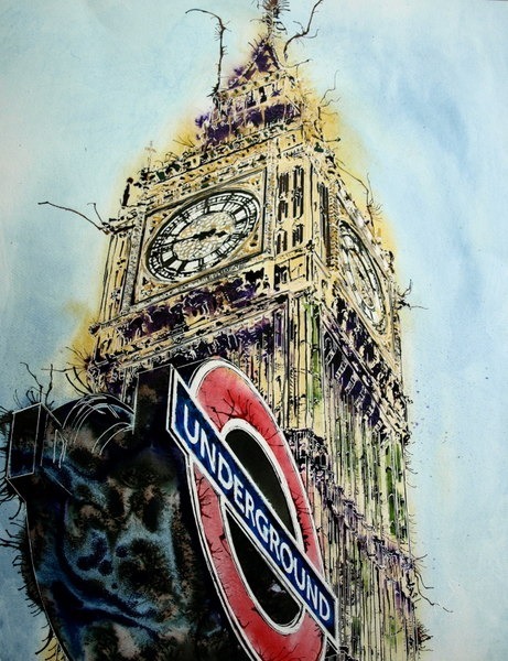
Big Ben or Elizabeth Tower, as it has recently been renamed, is probably the most iconic image of London. The seat of the British Government. In the foreground is the Underground symbol, part of the transport system essential to the running of the city. Two distinct symbols side by side. There are few, if any, London Icons which spring to mind before Big Ben. Dominating the picture, the image of Elizabeth Tower looms boldly against a pale, blue sky. Ostentatious attention-seeking, the tower has gravitas yet the numerous twiddly bits give it a sense of frippery. The tower has always had the associated monica of Big Ben. Of course, everyone knows it’s the bell that’s named Big Ben but you can’t see or hear it here. The sound of the bell is more felt than heard. Deep and resonating as it chimes the hours.
If ever there was a symbol of London, Big Ben is it.
Below there’s another symbol,
The Underground sign muscling in at the bottom left hand corner. It too, cannot be ignored. Modern and brash, contrasting with the elegance of the clock tower. The dark zones daring to add visual interest. Organic patterns within the paintwork belie the man-made structure it’s recreating.
Another iconic feature of London that’s instantly recognisable, the Underground sign evokes very different emotions to the clock face and tower. One speaks of light and hope, and the other?
Well, what does it evoke?
The need for movement? Reliability? I expect there are many more answers to that question than can think of.
Notice the colours? The pale purplish blue of the sky, the ochre of the tower, the black and red of the sign are the dominant colours. but look closely and you’ll see purples, moss greens browns and pinks. And, as you go past, the light catches the gold leaf on the clock face and tower.
The Clock Face itself is another feature that demands attention in the diva icon. Photographs will never do it justice, compared to seeing the tower in reality. Here the face is distorted by perspective frozen in time, a metaphor perhaps? The passage of time is dependent on your perspective when you look at it. Moments of the same length can pass quickly or slowly, it’s all relative.
These are Digital prints based on the original painting which was created in England in 2016. Please select size. All prints are on watercolour paper.
How the original Painting was created
All copyrights are retained by the artist, and that the artwork cannot be reproduced without consent from Cathy Read. This is an A4 Digital Print. The original picture was initially drawn with pencil onto watercolour paper. These lines were then drawn over using masking fluid and then painted using watercolour paint and acrylic ink. Salt was also used in the process and some of the ink blown around using a straw. Once the painting was dry the masking fluid was removed to reveal the finished painting.

Reviews
There are no reviews yet.