
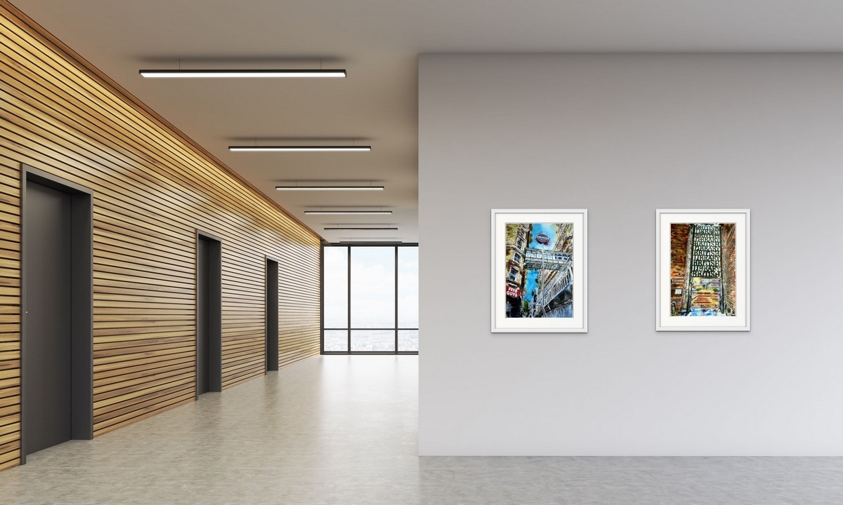
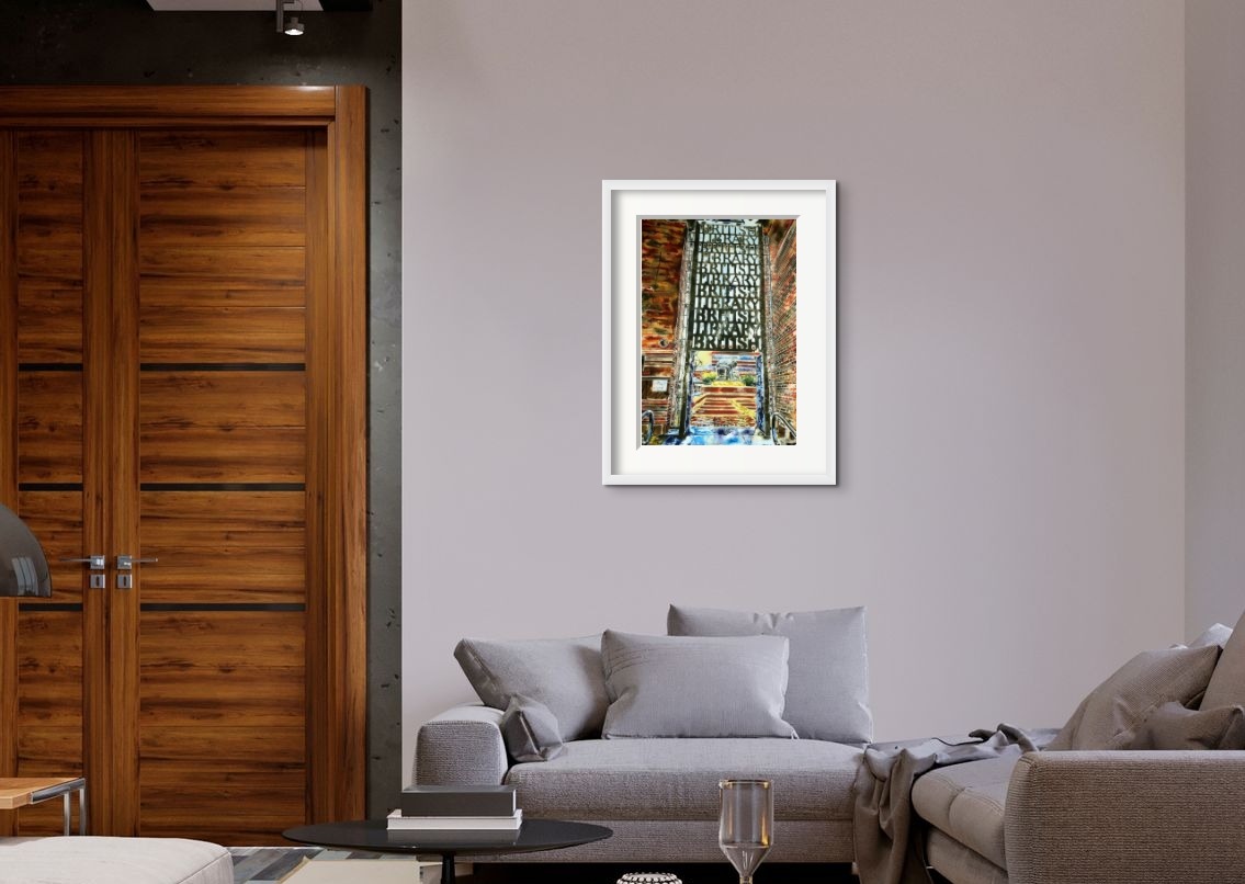
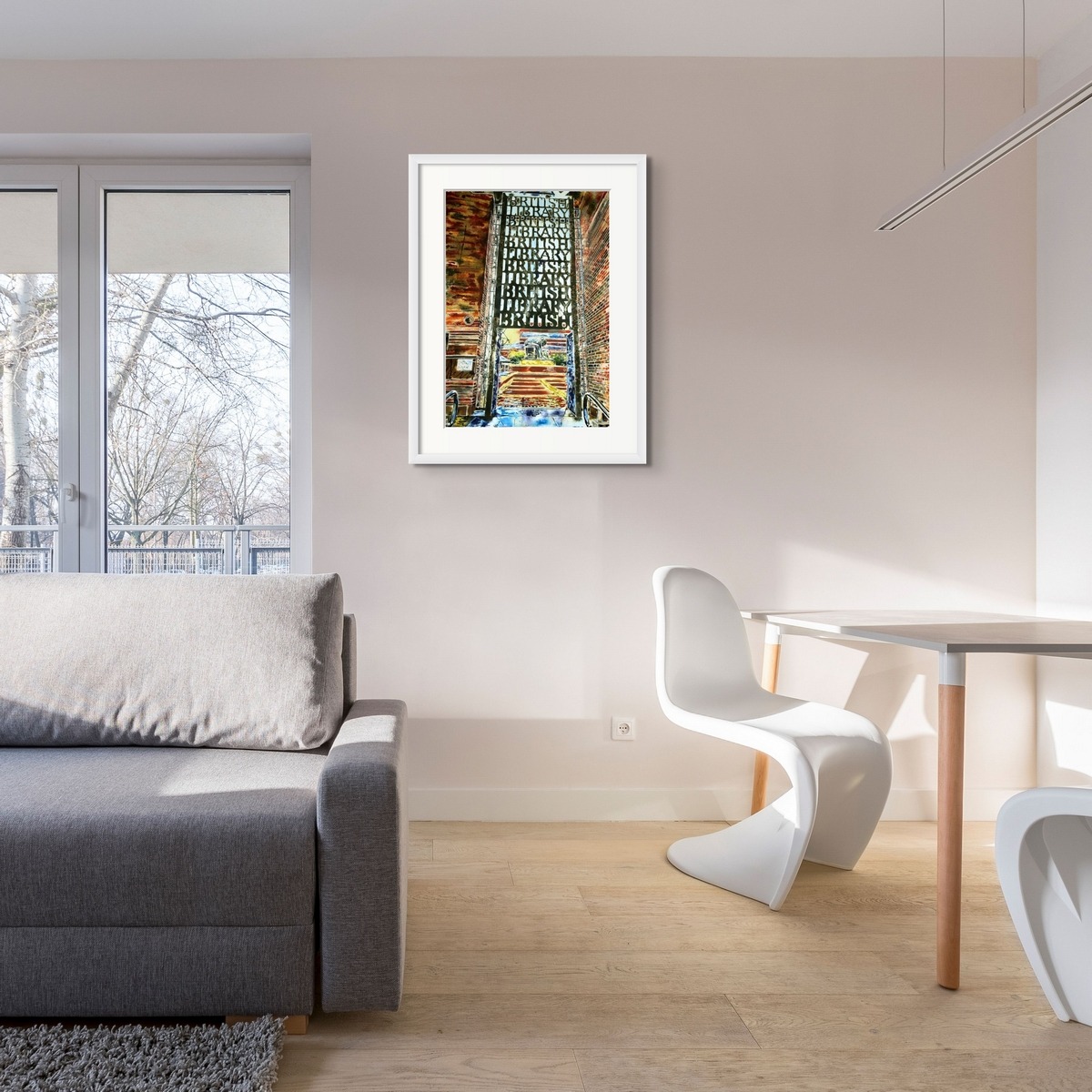
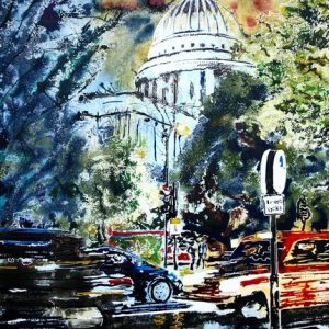
British Library – Original Painting
When looking at this British Library gates painting, the first thing you notice are the words British Library repeated in a rising stack. Each layer upwards the font becomes more delicate and light. It’s as if the lower levels need to be reinforced to hold the weight of those further up. This ironwork creation marks the entrance to the British Library and continues onto the doors which open inwards. Held in place either side by a simple rectangular grating.
What could be a more appropriate symbol for the library than a stack of words? Like a stack of books. Eloquent and simple. The clarity of the words increases as your eyes scans up. The density of the black increases as you go down.
The image feels slightly crooked. The reference photo was taken when passing on a rainy October day. I chose not to straighten it. It helps capture the spontaneity of the image and adds to the sense of looming in the structure.
The dark entrance looks through to a terracotta pathway framed with gold. Once you go beyond the English words, it feels like the entrance to an oriental temple. The text leaves you in no doubt of where you are. Framed by the gates with its Iron grid of letters. Centre stage, a giant figure bends double, intent on this “work”. He holds a pair of compasses or dividers with the skill and delicacy of practised hands. His task, whatever it is, demands his full attention. He’s oblivious to our presence.
Around the gates, brickwork competes for attention. In some parts so clear , you can count them, and in others they merge into an organic mass of rust and clay hues. The odd shape lifts the colour to contrast with the darkness.
What is the font?
British Library? It should be. A repository of knowledge as vast as the British Library really should have it’s own font. A nice serif font with gravitas. It ticks the boxes, surely they wouldn’t use Times New Roman?
After the initial meditation
The gates were designed by David Kindersley an alphabetician and letter designer. How apt that I should learn something new when studying a painting of the British Library gates!
Books and libraries are an endless fountain of knowledge and so, it seems, are the buildings that house them.
Creation: An initial pencil drawing onto watercolour paper was created. These lines were then drawn over using masking fluid. Next, they were painted using watercolour paint and acrylic ink. Several layers of paint were built up. Salt was also used in the process and some of the ink blown around using a straw. Once the painting was dry the masking fluid was removed to reveal the finished painting.
Reviews
There are no reviews yet.